Heat maps with income level of men and women

Statistics Netherlands (CBS) is studying new types of visualisations to present complex data at a glance. An example is the heat map, in which a value is represented by a progressively darker colour as it is more prevalent. In these heat maps, ‘Income according to age’, distinct differences are seen between men and women.
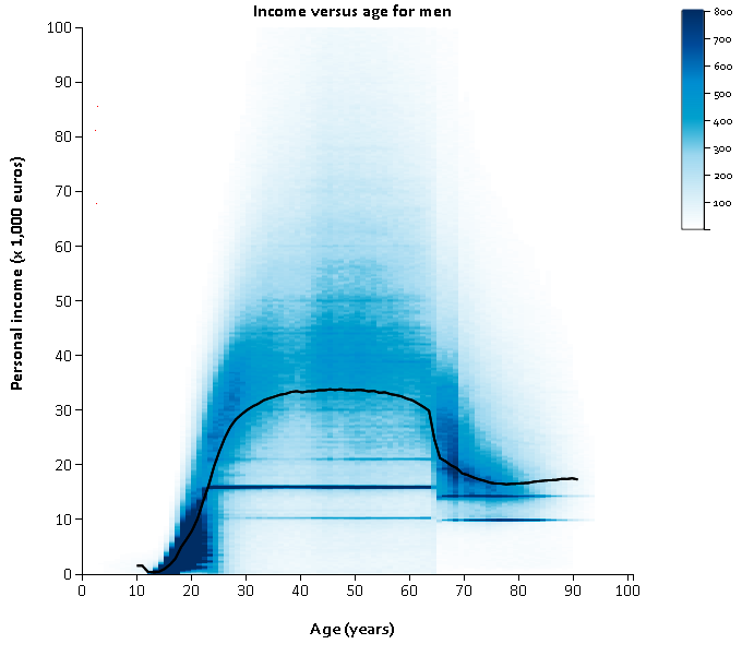
The heat map is a point cloud representing all inhabitants of the Netherlands. In this case, patches with a certain colour intensity refer to people of the same age and with the same income.
These heat maps show personal income distribution of men and women by age separately. They represent all persons up to and including the age of 100 years with income levels up to 100 thousand euros. For reference, the median income levels for both men and women are shown as a black curve. Click on each graph for more background information and cross-sections of specific ages and income levels.
Income of women by age, 2015

Income of men by age, 2015
Differences in income between men and women
In 2015, there were 13 million people in the Netherlands who had some form of income. Their median income was 23.5 thousand euros. The median income of the female population was considerably lower than that of the male population: 17.7 thousand versus 31.6 thousand euros.
Until around the age of 25, the median income is quite similar for both sexes. The gap widens progressively as ages go up and as people get older. This is partly explained by the fact that women tend to work fewer hours due to childcare responsibilities and earn less as a result. Women are less often employed in paid jobs, are more likely to work part-time, are underrepresented in senior management positions and earn less per hour than men, as was reported by CBS in the Emancipation monitor.
It is only from the age of 50 that the income gap between men and women narrows again. Men and women alike are entitled to a state pension (AOW) from around the age of 65, even if they had little or no income previously. However, due to the fact that men are more likely than women to receive a supplementary pension and the amount they receive tends to be higher, their personal income is on average also higher than women’s.
Typical income levels
Both charts feature a number of horizontal lines. These represent people between the ages of 23 and 64 who are receiving an equal amount of income support. This amount depends solely on their position in the household: single, single parent or half of a couple.
The chart contains other, less obvious horizontal lines. Minimum wages are set around 21 thousand euros, but there the gender gap is more diffuse as compared to income support levels, owing to part-time work, among others. Other increased concentrations of income level for people between 18 and 64 are most likely related to pay scales for civil servants and collective wages for more common occupations as are laid down in collective labour agreements. Among higher incomes in particular, rounded figures (e.g. 30, 40, 50 or 60 thousand euros) are shown in a somewhat lighter shade. These are mainly self-employed entrepreneurs and directors/major shareholders.
In addition, two distinct vertical lines can be seen which run through the entire income spectrum in the positions held by ages 65 and 68. For many people, 65 is the retirement age, and in 2015, people at age 68 were those born in the babyboomer cohort (starting in 1946). See also the population pyramid.
Safeguards to ensure privacy
The income spectrum is truncated in each year of age so that each cell in the chart contains a minimum of 10 persons. This means the patch preserves its distinct shape, while individual ages and income levels are still not distinguishable. In addition, the income distribution is smoothed out by obtaining the numerical mean.
Method
The histograms were developed in the following way:
- Income levels and ages of all individuals were obtained from the Dutch tax authorities and the Municipal Personal Records Database (BRP) respectively. The reference date for ages was 1 January 2015, for income levels the reference year 2015 was used.
- Ages up to and including 100 years are indicated applying a resolution of complete years.
- Income levels up to a maximum of 100 thousand euros are indicated applying a resolution of 200 euros.
- All measures listed above were applied to the collected data to safeguard personal privacy.
- The colour scale runs up to a maximum of 800 persons or more per cell. This way, the details in scales with lower numbers of people can still be distinguished.
Applications
The advantage of this type of visualisation is that all observations are shown at a single glance, with the focus on distribution. Aside from incomes, other types of data with absolute figures can easily be displayed in heat maps. For example, rather than data on people, it may concern day-to-day temperatures, hospital admissions, or number of vehicles on Dutch roads.
Your feedback is welcome
The production of heat maps to visualise register data and other large datasets is a relatively new development at CBS. We would like to know your opinion, whether it is a general impression or specific details which you do or do not like. Are these maps a welcome addition to the present-day supply of charts and graphs? Is the visualisation clear and easy to comprehend?