More insight into mobility with the doughnut map
Statistics Netherlands, in collaboration with the University of Oxford, developed a new visualisation method to gain insight into mobility. This method has been applied to data on jobs of employees.
Used data
The used dataset contains job counts. The jobs counts are split by home and work municipality for December 2019. Only jobs of employees are taken into account. Self-employed jobs are excluded. Because a person may have multiple jobs simultaneously, these counts may not be the same as employee counts. The job counts have been rounded to hundreds. Jobs of which the home and/or work municipality are abroad or unknown have been excluded. These open data are available at CBS StatLine.
This data does not contain information about the actual commutes, such as the commuting route, the mode of transport, and the frequency of commuting.
Current visualization methods
A frequently used method to show these kind of data is the flow map, in which curved lines are drawn between home and work municipality. The line width is proportional to the number of jobs. An example is shown below (left hand side).
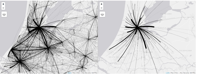
The lines have been curved to prevent overlap with the lines in opposite direction (for instance the line from Utrecht to Amsterdam does not overlap with the line from Amsterdam to Utrecht). A downside of this method is that it is hard to extract information from this map. This is mainly caused by the large number of lines.
This problem can be solved by showing a selection of data. An example is shown in the map above (right hand side) in which only job numbers are shown with Amsterdam as work municipality. Although this method provides a clear image for Amsterdam, it is hard to obtain a complete overview of the whole region.
New visualisation method
The newly developed visualisation method is the doughnut map, shown in the first image. A flow from home to work municipality is plotted by a line from the half-way point towards the work municipality. The lines are coloured by work municipality, where separate colours have been used for several large municipalities and where flows to other municipalities are coloured blue. The pink lines correspond to jobs of people who work in Amsterdam and live elsewhere. Flows representing less than 500 jobs are not shown because otherwise too many lines would overlap each other.
For each municipality a small doughnut chart has been plotted. The size of the doughnut is proportional to the number of employee jobs of the residents from that municipality. The doughnut itself displays the work municipalities of those jobs.
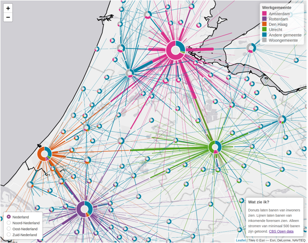
In the interactive doughnut map, the underlying data are shown by clicking on lines and doughnuts. There are four displays. The first display shows the whole country, where a distinct colour has been assigned to each of the major four cities (Amsterdam, Rotterdam, The Hague, and Utrecht). The remaining three variants only show the numbers of jobs of specific parts of the country; Nord Netherlands, East Netherlands, and South Netherlands. In each display, several large municipalities have their own distinct colours.
Tool for policy-makers
This new visualisation method shows how connected the Netherlands is, how many people are prepared to travel far between municipalities, and which cities attract most employees from far away. While it is difficult to extract the connectedness between municipalities from a table, the doughnut map illustrates this connectedness.
Visualisation methods like the doughnut map are handy tools for policy-makers, enabling them to analyse and improve the infrastructure between municipalities. The doughnut map can, for instance, help explain where people who are stuck in certain traffic jams come from and go to, and show possible impacts of new bicycle or train connections. The data can be further enriched with properties of the companies where people are employed. Furthermore, data from several years can be analysed, which enables research on the effect of new infrastructure, new residential areas, and new business parks.
Policy objectives relating to climate change mitigation, wellbeing, accessibility, and air pollution demand that data should not only be accessible to data specialists, but to a wide range of stakeholders. Visualisations such as the doughnut map help to make data on complex flows insightful for a wide audience.
For further analysis of commuting, more data is needed on the actual commutes. How often do people travel to work, what modes of transport do they take, and which routes? Statistics Netherlands is currently working on these topics.
Feedback
The visualisation method can be further developed and applied to other similar data. Therefore, Statistics Netherlands would like to know your opinion. How informative is this visualisation method? Do you have suggestions to improve the method? Please let us know via the form below.