A picture says more than a thousand words

Understanding data
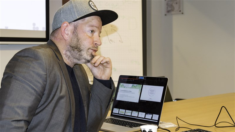
As the saying goes, a picture says more than a thousand words. But this is certainly also the case for numbers, as these are becoming increasingly important, according to Kay Schröder. ‘Society is steeped in data, understanding them is becoming more and more important.’ The aim of collaborating with CBS is to find out which type of visualisation is best suited for efficient presentation and exploration of data. ‘Over the coming few months, we shall focus on developing prototypes in the field of open data visualisation’, Schröder explains. A core expertise of BISS lies in the smart interaction between humans and data. Their Human-Data Interaction Lab plays a key role in this regard. ‘That is where we not only develop new forms of visualisation, but also test and assess them along with co-workers and students. This is how we work continuously towards improving visualisations.’
Design, film production and media
Another key strength of BISS is its close cooperation with the Maastricht Academy of Media, Design and Technology. ‘Data visualisation is often organised within an IT department, but we are also drawing on the expertise available within the Academy in the areas of design, film production and media. Aside from this, BISS’ work has overlaps in many other areas of expertise such as data science and analytics’. Schröder is enthusiastic about partnering with CBS. ‘CBS is not just a source of open data, it is also an organisation which is looking to present these data to a large audience in a clear and concise manner. In addition to the fact that CBS is just around the corner here in Heerlen, this is a great starting point for fruitful cooperation.’
Interactive presentation
Schröder has worked in data visualisation for over ten years and has received various international awards for his work. He has led large international projects in data visualisation and data communication, including projects for the United Nations (IPCC) World Climate Programme. Data visualisation looks set to become increasingly interactive, he predicts. Inspiring examples are visualisations in the New York Times in the form of storytelling where, for example, a graph is not a static item but an interactive presentation giving the user an overview of a particular development. ‘The data are leading while the text is additional. As you scroll down, a complete story unfolds before you’, Schröder explains, ‘standing in contrast with the classic standard graph presentation also used by CBS, where the text is often leading.’ That said, storytelling is only one of numerous innovative methods in data visualisation. Therefore, it is still hard to say which particular types of visualisation will come out of this collaboration project as being the most suitable: ‘The power of this collaboration lies in developing and enhancing visualisations. In time, the gathered know-how and the results will be incorporated into CBS’ production workflow.’
Searching
Foske Kleima, manager of the Creation and Visualisation team at CBS, is equally enthusiastic about the collaboration project between CBS and Kay Schröder, the BISS institute and the other partners. ‘Visual graphic elements are becoming more and more important, for CBS too; we are already producing video messages, GIFs and graphs which present the data to our users in the best and most accessible way possible. CBS took its first steps on this path early last year, and is still looking for the best way to present the stories behind the data in a concise and compact manner while focusing on speed and user friendliness.’
Phenomenon-oriented topics
CBS is not only planning to produce visualisations of its data, but is also looking more and more at a comprehensive and clearly laid out presentation range of phenomenon-oriented topics. ‘Through the use of dashboards, for example, which give users insight into certain data at a mere glance. Our ICT team are working on the development of this particular format; at the moment, they are gearing in on price indices and labour market figures. In addition, we would like to produce more visualisations together with the Urban Data Centres in the cities that have teamed up with CBS to collect data at local and regional level.’ Across the board, CBS is steadily building up know-how in these areas. The recent extension of the CBS audiovisual studio will certainly contribute to this. In this studio, infographics specialists and students from universities of applied sciences such as Avans can work on their assignments. ‘Apart from these developments, together with Kay Schröder, CBS staff are commencing joint research on effective visualisations for big data. They have already begun the first few experiments in this area’, says Kleima.